Fetching and Visualizing Forex Data in Python with yfinance
I am preparing for a Forex-related interview, so after some research, I’ve summarized how to get Forex data in Python. In this blog, we will use yfinance and seaborn to fetch hourly exchange rates for EUR/USD, check the data quality, and finally, plot the closing prices in a line plot.
Install Packages
To get started, we need the following packages:
- yfinance: to fetch Forex data
- matplotlib: for plotting
- seaborn: for enhanced plotting with better visualization
1pip install yfinance matplotlib seabornFetch the Data
 1import yfinance as yf
 2import seaborn as sns
 3import matplotlib.pyplot as plt
 4
 5sns.set_style("whitegrid")
 6
 7# Define the forex pair and date range
 8pair = "EURUSD=X"
 9# Define the start date and end date
10start_date = "2024-01-01"
11end_date = "2024-12-31"
12# Define the interval
13interval = '1h'
14
15# Fetch forex data
16forex_data = yf.Ticker(pair)
17
18
19# Fetch historical forex data
20data = forex_data.history(start=start_date, end=end_date, interval=interval)
21
22# Data overview
23data.info()
24
25"""Output
26<class 'pandas.core.frame.DataFrame'>
27DatetimeIndex: 6178 entries, 2024-01-01 18:00:00+00:00 to 2024-12-30 23:00:00+00:00
28Data columns (total 7 columns):
29 #   Column        Non-Null Count  Dtype
30---  ------        --------------  -----
31 0   Open          6178 non-null   float64
32 1   High          6178 non-null   float64
33 2   Low           6178 non-null   float64
34 3   Close         6178 non-null   float64
35 4   Volume        6178 non-null   int64
36 5   Dividends     6178 non-null   float64
37 6   Stock Splits  6178 non-null   float64
38dtypes: float64(6), int64(1)
39"""
Data Quality Check
Missing values
We can check the missing values by
 1data.isna().sum()
 2
 3""" Output
 4Open            0
 5High            0
 6Low             0
 7Close           0
 8Volume          0
 9Dividends       0
10Stock Splits    0
11dtype: int64
12"""
No missing values, nice :)
Removing Irrelevant Columns
Upon closer inspection, we notice that the Volume, Dividends, and Stock Splits columns have all values equal to 0. These columns are not useful for our analysis, so let’s drop them.
 1cols = ['Volume', 'Dividends','Stock Splits']
 2(data[cols] == 0).all()
 3
 4""" Output
 5Volume          True
 6Dividends       True
 7Stock Splits    True
 8dtype: bool
 9"""
10
11data.drop(columns= cols, inplace = True)
After this, we have a cleaned DataFrame.
 1data.info()
 2
 3""" Output
 4DatetimeIndex: 6178 entries, 2024-01-01 18:00:00+00:00 to 2024-12-30 23:00:00+00:00
 5Data columns (total 7 columns):
 6 #   Column        Non-Null Count  Dtype
 7---  ------        --------------  -----
 8 0   Open          6178 non-null   float64
 9 1   High          6178 non-null   float64
10 2   Low           6178 non-null   float64
11 3   Close         6178 non-null   float64
12 4   Volume        6178 non-null   int64
13 5   Dividends     6178 non-null   float64
14 6   Stock Splits  6178 non-null   float64
15dtypes: float64(6), int64(1)
16"""
Data Visulazation
We will now use seaborn to plot the hourly closing prices.
1import seaborn as sns
2import matplotlib.pyplot as plt
3
4# Set up the plot style
5sns.set_style("whitegrid")
6plt.figure(figsize=(12, 6))
7
8# Plot the hourly closing prices
9sns.lineplot(x=data.index, y=data["Close"])
10
11# Formatting the plot
12plt.xlabel("Date")
13plt.ylabel("EUR/USD Hourly Closing Price")
14plt.title("EUR/USD Hourly Closing Price (2024)")
15plt.xticks(rotation=45)
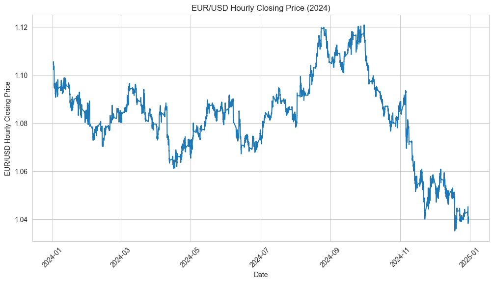
16plt.show()This will generate a line plot showing the hourly closing prices for the EUR/USD pair in 2024.
Conclusion
In this blog, we learned how to fetch Forex data using the yfinance library, cleaned the dataset by removing irrelevant columns, and visualized the EUR/USD hourly closing prices with seaborn. This simple step can serve as the foundation for more complex Forex analysis and hedging strategies.
#fintech #python #seaborn #yfinance